

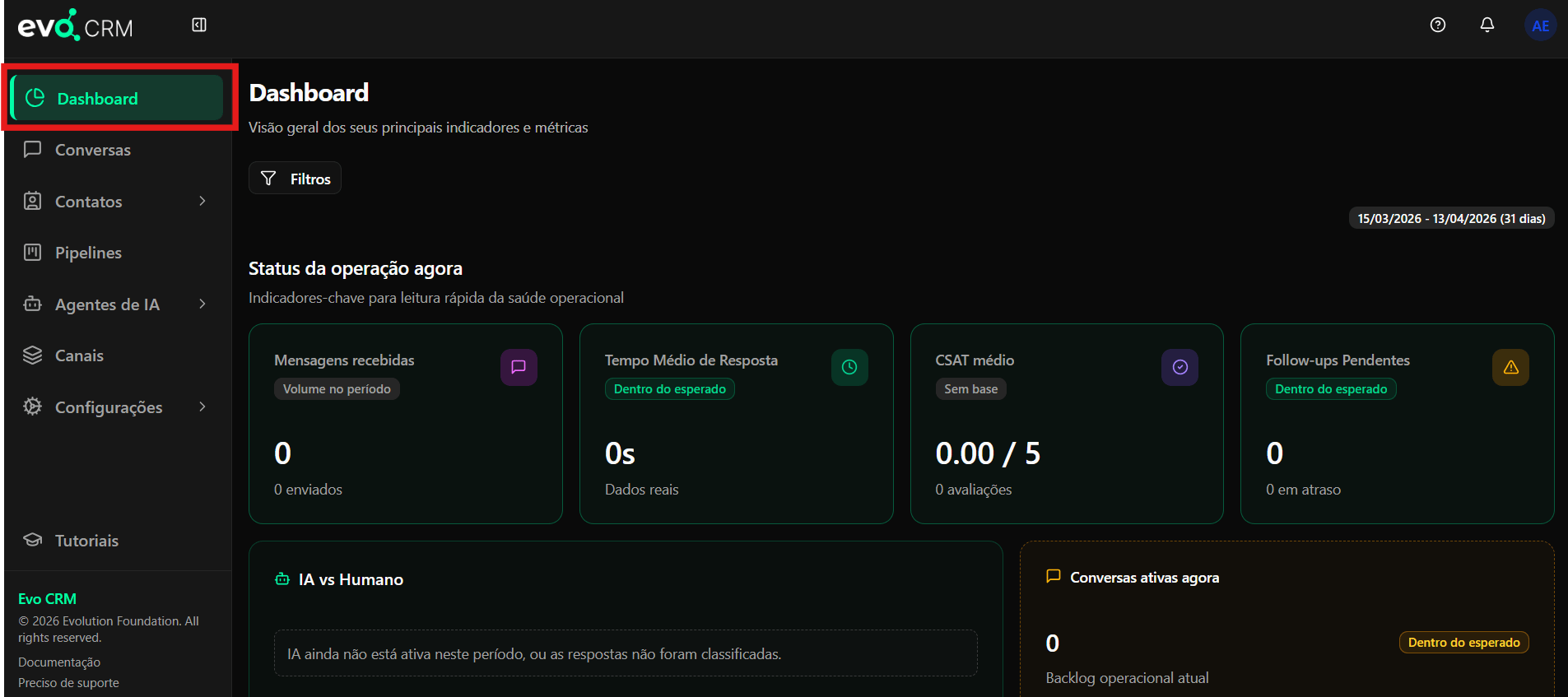
Accessing the Dashboard
The Dashboard is available in the left sidebar, identified by the clock icon and the label Dashboard. It is the first screen displayed when you log in to Evo CRM.Filters and Analysis Period
At the top of the page, you will find the Filters button and the period selector. The default period shows the last 31 days, but it can be adjusted as needed for specific interval analysis.- Filters: allows you to segment data by channel, team, agent, or other available criteria.
- Period: displays the currently selected date range (e.g.,
03/15/2026 - 04/13/2026 (31 days)).
Current Operation Status
This section presents four key indicators for a quick read of your team’s operational health.Messages Received
Displays the total number of messages received in the selected period, along with the total messages sent.- Context badge: indicates whether the volume is within or outside the expected range.
- Data shown: absolute number of messages received and sent.
Average Response Time
Shows the average time the team takes to respond to contact messages.- Context badge:
Within expectedor another status based on configured thresholds. - Data shown: average time in seconds, minutes, or hours.
- Note: the
Real datalabel indicates the calculation uses actual response data, not estimates.
Average CSAT
Displays the average customer satisfaction score (CSAT) based on ratings collected during the period.- Context badge:
No baselinewhen there are not yet enough ratings for calculation. - Data shown: average score on a
0.00 / 5scale and the total number of ratings received.
Pending Follow-ups
Indicates how many follow-ups are awaiting action from the team.- Context badge:
Within expectedor alert status. - Data shown: total pending follow-ups and how many are overdue.
AI vs Human
This section compares the volume of responses generated by AI with responses handled by human agents during the selected period. When no data is available (AI inactive or responses not classified), the following message is displayed:AI is not yet active in this period, or responses have not been classified.Once AI is configured and active, this chart will show the distribution between automated and human interactions.
Active Conversations Now
Displays the number of conversations currently in progress, representing the real-time operational backlog.- Context badge:
Within expectedor an alert when the volume exceeds defined thresholds. - Data shown: total active conversations at the time of the query.